mannat pardasani

mannat pardasani

Graphic designer and web developer creating visual identities and digital experiences.

Lune
project overview

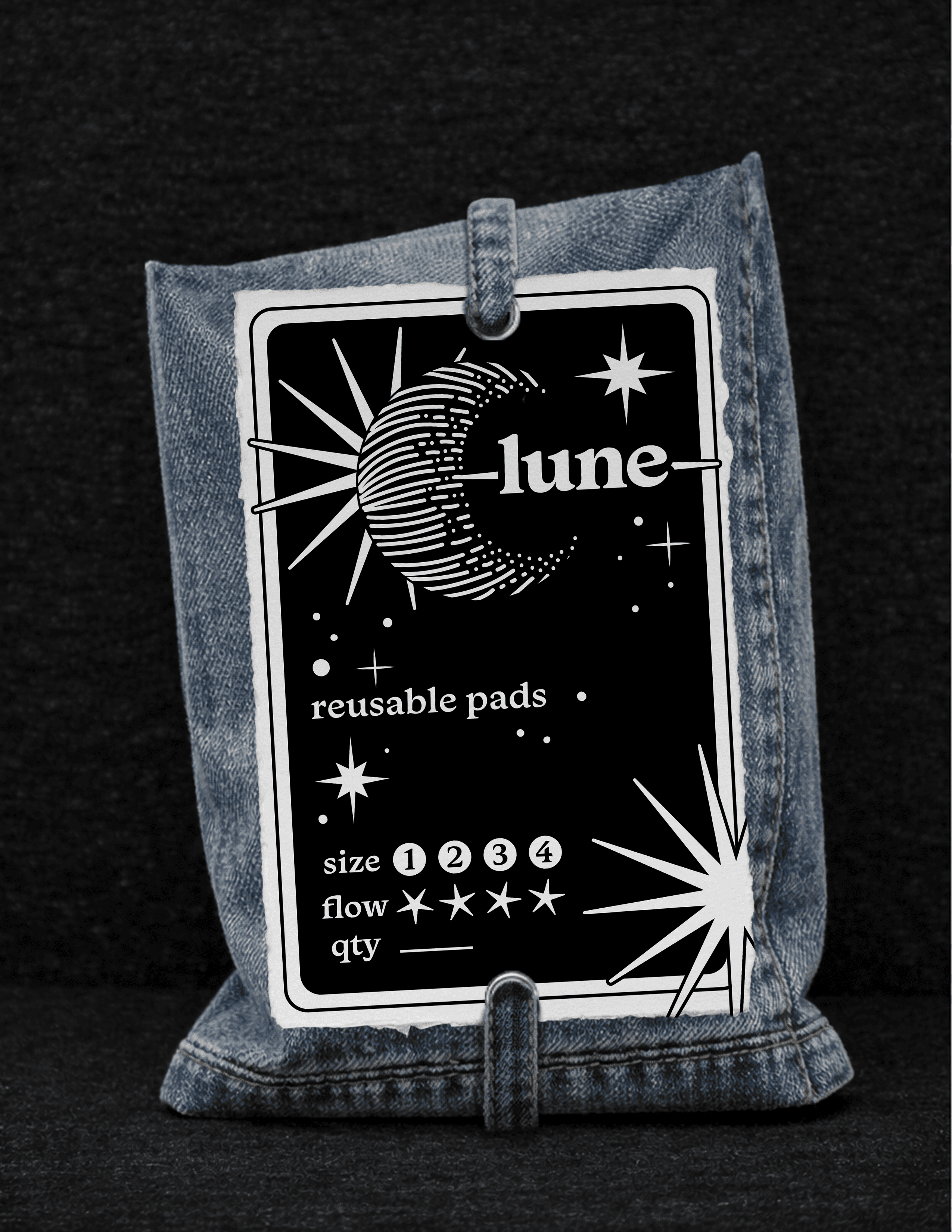
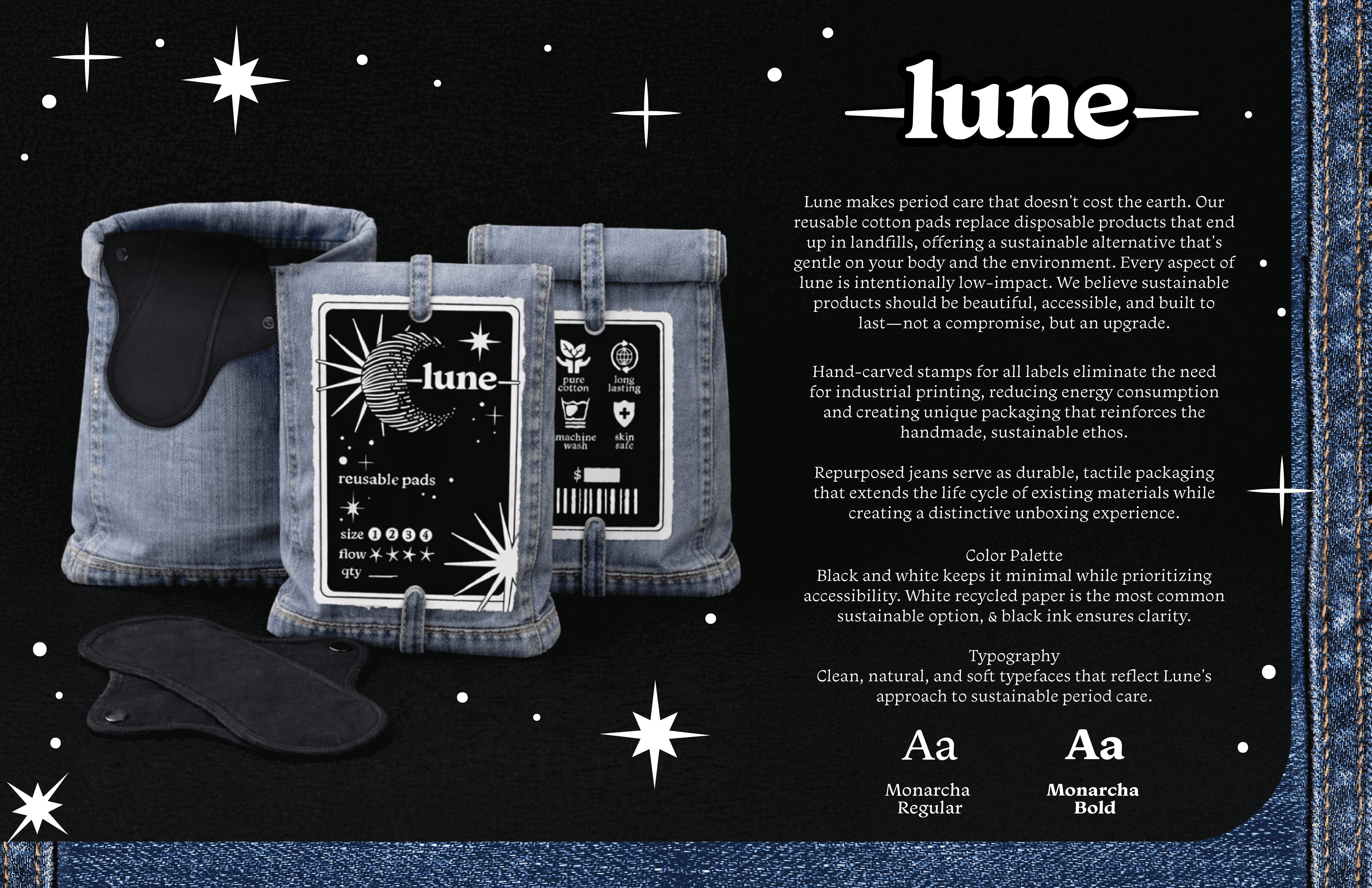
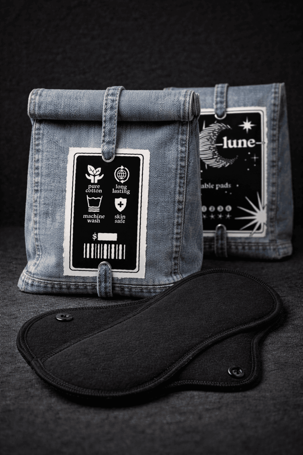
lune is a sustainable menstrual care brand offering reusable cotton pads as an alternative to disposable products. With the average menstruating person using 11,000-16,000 disposable pads in their lifetime, lune addresses both environmental waste and personal health through thoughtfully designed, low-impact products. The brand identity centers on handmade craft: linocut-stamped labels, recycled denim packaging, and a black-and-white aesthetic inspired by Japanese rice bag design. Every element eliminates industrial printing infrastructure while maintaining premium quality. The packaging itself becomes reusable storage, extending the philosophy of sustainability beyond the product.

project type

Sustainable Packaging

year

2026

software

adobe illustrator + photoshop + ai generated images

client

(hypothetical)
process
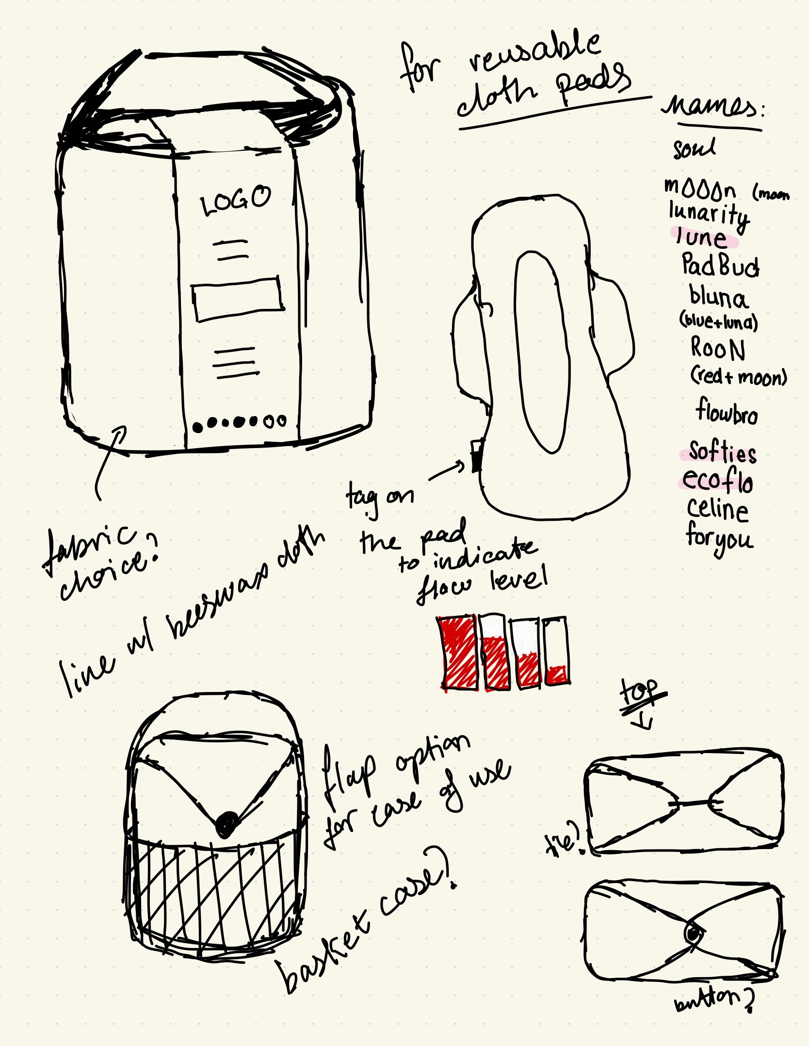
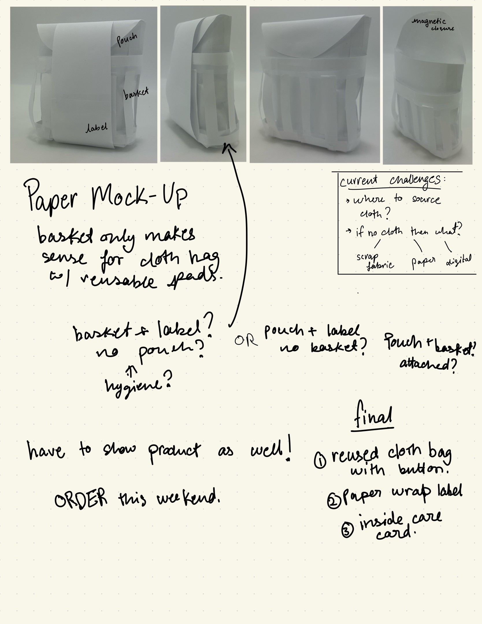
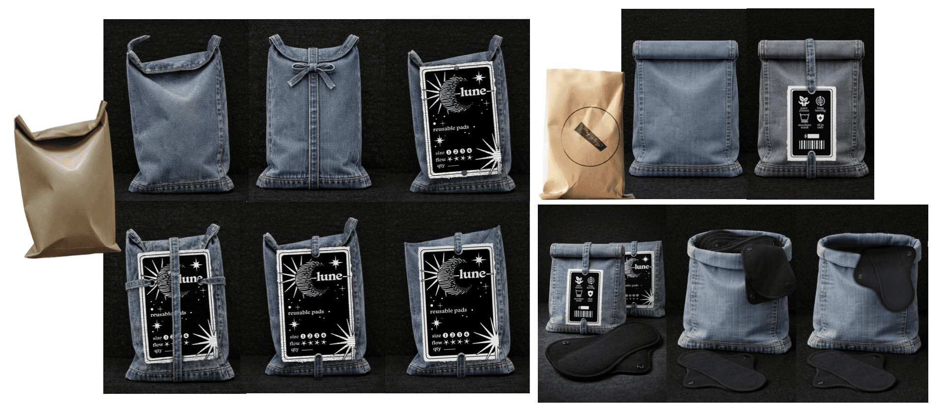
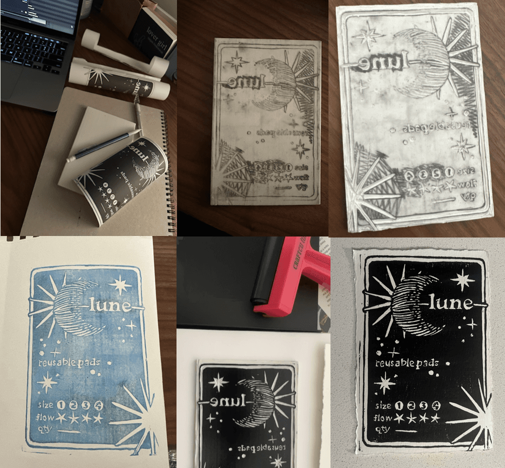
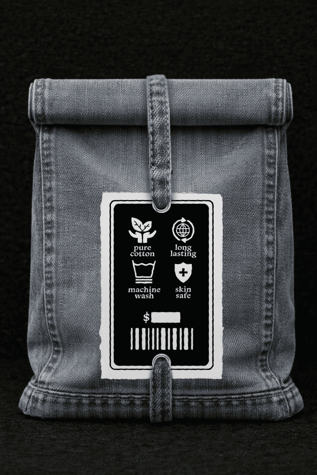
The project began with research into Japanese rice bag packaging. I sketched bag constructions testing stability and closure methods, exploring how packaging could transition from shipping container to permanent storage. For the label, I explored crescent moons with horizontal line hatching, elegant and carvable for linocut. Typographyuses Monarcha, balancing sophistication with approachability. Learning linocut from scratch, I carved a stamp for the label, testing prints to refine line weights and details. The final stamps were printed on textured watercolor paper with black ink. I used AI image generation to visualize denim bag variations, then refined outputs in Photoshop, correcting proportions, and adding realistic lighting.

The project began with research into Japanese rice bag packaging. I sketched bag constructions testing stability and closure methods, exploring how packaging could transition from shipping container to permanent storage. For the label, I explored crescent moons with horizontal line hatching, elegant and carvable for linocut. Typographyuses Monarcha, balancing sophistication with approachability. Learning linocut from scratch, I carved a stamp for the label, testing prints to refine line weights and details. The final stamps were printed on textured watercolor paper with black ink. I used AI image generation to visualize denim bag variations, then refined outputs in Photoshop, correcting proportions, and adding realistic lighting.